


App Ideas beyond AboutMe
It turns out that many apps use the same or similar layout principles to implement entirely different functionality.
What interesting apps could you imagine building using the basic layout and interaction ideas shown for the AboutMe app?
Browse around Google Play and look at different app designs for inspiration.
Note: You don’t need to know how to implement them.
Things to think about
Some app ideas that come to mind for AboutMe are user profiles, news articles, a resume, records of your pet's information, or a simple blog.


Android Developer Documentation:
NOTE We recommend you update to Android Studio Version 3.3 . You can download it from the Beta Channel in Android Studio. Select the Preferences menu (or Settings in Windows) and search for Updates. There you can select "Beta Channel" and then click on "Check Now" to locate and download the new version.
Now it’s your turn to complete this exercise.
Every app in Android Studio starts with creating a project.
Creating the About Me App
The exercises for these lessons were done with Android Studio Version 3.3.
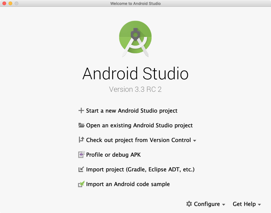
1. Welcome to Android Studio
First, open Android Studio. You should see this window. Go ahead and click "Start a new Android Studio Project".
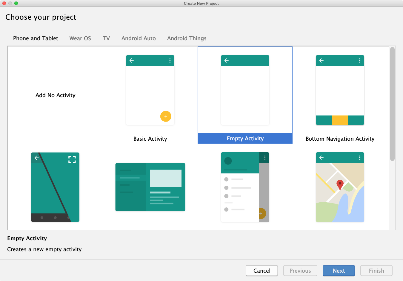
2. Choose your Project
On the next page you will be presented with several device platform tabs, each with different templates for adding an Activity.
From the "Phone and Tablet" tab choose "Empty Activity," and click "Next" again.
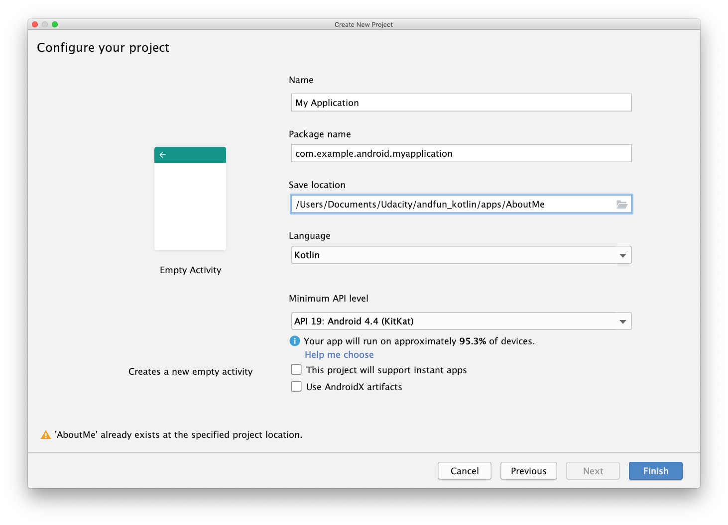
3. Configure Android Project
For this app use this configuration:
Name: Dice Roller
Package: com.example.android.aboutme
Project location: < Your choice of where to save this project on your computer >
Language: Kotlin
Minimum API: leave the default values
We've decided to build this project for "Phone and Tablet" with Minimum SDK of API 19. As of the time we wrote this course, that gave us 95.3% coverage of devices and allowed us to have support for many modern features.
Remember that you can use the "Help me choose" link to see the Android Platform/API Version distribution to see the percentage of active devices running with each API.
Finally, click "Finish" to create your About Me project.
Depending on your computer and network speed, it might take a minute to set up and build your project. This might be a good time to do a stretch, get some tea, or start watching the next video.
Android Developer Documentation:
Android Developer Documentation:
Now it’s your turn to complete this code.
Every Activity that is visible on the screen needs a layout, defined in a layout file. Because you did not create the MainActivity with a layout from a template during project creation, you are next going to need to add a layout file.
Like other resources, layout files are stored in the res resources folder.
- In the Project > Android window, open the res folder, so you can see what is happening.
- Right-click res.
- In the pop-up menu, select New > Android resource file.
In the New Resource File window:
- Name the file activity_main.xml.
- For the Resource type, choose Layout.
- If it is not already selected, for the Root element, choose LinearLayout.
- Verify that the source set is main.
- Verify that the directory name is layout.
- If everything looks correct, click OK.
This creates the activity_main.xml file in the res/layouts folder.
Notice that if the layout directory, didn’t already exist, Android Studio created it for you.
If you want to start at this step, you can download this exercise code from: Step.01-Exercise-Create-layout-file.
You will find plenty of //TODO comments to help you complete this exercise, and if you get stuck, go back and watch the video again.
Once you’re done, you can check your solution against the solution we’ve provided here: Step.01-Solution-Create-layout-file, or using this git diff.
Layout Editor Basics
Android Developer Documentation:
QUIZ QUESTION
Match the parts of the Layout Editor with their descriptions.

Adding a TextView
Android Developer Documentation:

Android Developer Documentation:

Android Developer Documentation:
QUIZ QUESTION
Match each term with its correct definition.

Now it’s your turn to complete this exercise.
You are going to do the following with AboutMe:
- Add a TextView. Give it an id of name_text. Set the width to match_parent and the height to wrap_content. Add a top margin of 16dp and top padding of 8dp. Set the text to your name.
- Style the TextView. Add the roboto font to your project and use it for the TextView. Set the text size to 20sp and change the text alignment to center.
- Add the textColor to @android:color/black.
- Create a style and extract all common resources as shown below.
- Add an ImageView below the TextView. Choose the btn_star_big_on resource as the image. Set the id to star_image and set the width to match_parent and the height to wrap_content.
- Get rid of the warning by adding a contentDescription; remember to extract it as a string resource.
- Run your app.
Here is how your style and extracted dimensions should look.
<style name="NameStyle">
   <item name="android:fontFamily">@font/roboto</item>
   <item name="android:paddingTop">@dimen/small_padding</item>
   <item name="android:textSize">@dimen/text_size</item>
   <item name="android:textColor">@android:color/black</item>
   <item name="android:layout_marginTop">@dimen/layout_margin</item>
</style>
<resources>
   <dimen name="text_size">20sp</dimen>
   <dimen name="small_padding">8dp</dimen>
   <dimen name="layout_margin">16dp</dimen>
</resources>
If you want to start at this step, you can download this exercise code from: Step.02-Exercise-Add-TextView-ImageView-Style.
You will find plenty of //TODO comments to help you complete this exercise, and if you get stuck, go back and watch the video again.
Once you’re done, you can check your solution against the solution we’ve provided here: Step.02-Solution-Add-TextView-ImageView-Style, or using this git diff.

Android Developer Documentation:
Now it’s your turn to complete this exercise.
- Add a ScrollView with a TextView showing information about yourself to the layout.
- Style the TextView with NameStyle, and add additional styling to separate the scrollable text from the edges of the screen.
- Add some spacing between the lines using the lineSpacingMultiplier property to the TextView.
android:lineSpacingMultiplier="1.2"/>
The "Extract dimension resource" menu option is not available for this attribute, so you will have to add it to dimens.xml by hand.
If you want to start at this step, you can download this exercise code from: Step.03-Exercise-Add-ScrollView.
You will find plenty of //TODO comments to help you complete this exercise, and if you get stuck, go back and watch the video again.
Once you’re done, you can check your solution against the solution we’ve provided here: Step.03-Solution-Add-ScrollView or, using this git diff.
Experiment with adding an ImageView above the TextView inside the ScrollView. When you run the app, this image, unlike the star, will scroll out of view as the text scrolls up.
Hint: You will need to wrap the two scrollable views into a LinearLayout inside the ScrollView. ScrollView > LinerLayout > ImageView + TextView
Below is a skeleton code version for this challenge.
The important thing to remember is that since ScrollView can only have one child, you have to wrap that ImageView and the TextView into a LinearLayout.
There is no solution code provided for this challenge, but the skeleton code below gives you the expected view hierarchy to use.
SKELETON code of view hierarchy:
<ScrollView
   android:layout_width="match_parent"
   android:layout_height="match_parent">

   <LinearLayout
       android:layout_width="match_parent"
       android:layout_height="wrap_content"
       android:orientation="vertical">

       <ImageView
           android:layout_width="match_parent"
           android:layout_height="wrap_content"
           app:srcCompat="@android:drawable/ic_menu_view" />

       <TextView
           android:layout_width="match_parent"
           android:layout_height="wrap_content"
           android:text="@string/some_long_text"/>

   </LinearLayout>

</ScrollView>
Android Developer Documentation:
Correction
Button dimensions should be:
            android:layout_width="wrap_content"
            android:layout_height="wrap_content"

Android Developer Documentation:
In this exercise, do the following to finish out the AboutMe app:
- Add an EditText to get input for the nickname. Style with NameStyle.
- Add a hidden TextView for displaying the inputted text. Style with NameStyle.
- Add a Done button.
- Add a click handler to the Done button that displays the inputted text in the TextView and hides the EditText and button.
In your click handler:
- Find references to the
nickname_editandnickname_text views. - Set the text of
nickname_textto the value ofnickname_edit: nicknameTextView.text = editText.text - Update the visibility of the views. Use
View.VISIBLEandView.GONEto set the visibility of the views.
In onCreate(), set a click handler like this:
findViewById<Button>(R.id.done_button).setOnClickListener {
   addNickname(it)
}
Hint: In your click handler, add this code to hide the keyboard after input is complete:
// Hide the keyboard.
val imm = getSystemService(Context.INPUT_METHOD_SERVICE) as InputMethodManager
imm.hideSoftInputFromWindow(view.windowToken, 0)
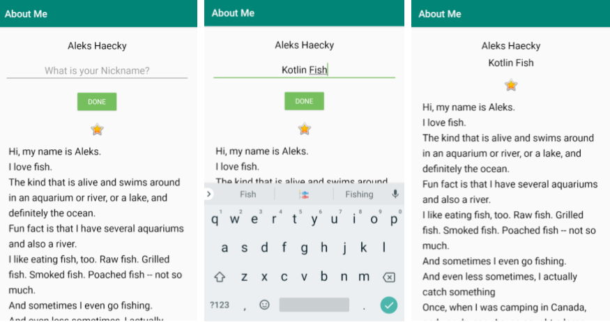
Here is what your finished app should look like.
If you want to start at this step, you can download this exercise code from: Step.04-Exercise-EditText-DoneButton-ClickHandler.
You will find plenty of //TODO comments to help you complete this exercise, and if you get stuck, go back and watch the video again.
Once you’re done, you can check your solution against the solution we’ve provided here Step.04-Solution-EditText-DoneButton-ClickHandler or using this git diff.


Android Developer Documentation:
A note about the view binding feature (Android Studio 3.6+) and data binding
In this course, we use data binding as a way to access views in a null safe and type safe way. In situations where you only need to access views and not use data binding's more advanced features, you can replace data binding with view binding, which is explained in Lesson 1.
Data binding's more advanced features include ways to write short logical expressions in your XML code, and enhanced functionality with Android Jetpack libraries. You will learn about these more advanced features throughout the course. These features are not available with view binding and because of this, data binding remains an important library to master.
In summary, when using Android Studio 3.6+, when you only need access to views, use view binding. If you need the more advanced features data binding provides, use data binding.
To learn more about how to use view binding in your app, check out the View Binding documentation and the Accessing Views portion of What's new in Architecture Components (Google I/O'19).
Android Developer Documentation:


Android Developer Documentation:
- Getting started with data binding
- Data Binding Library
- Generated Binding Classes
- Layouts and binding expressions
Data Binding - The Idea
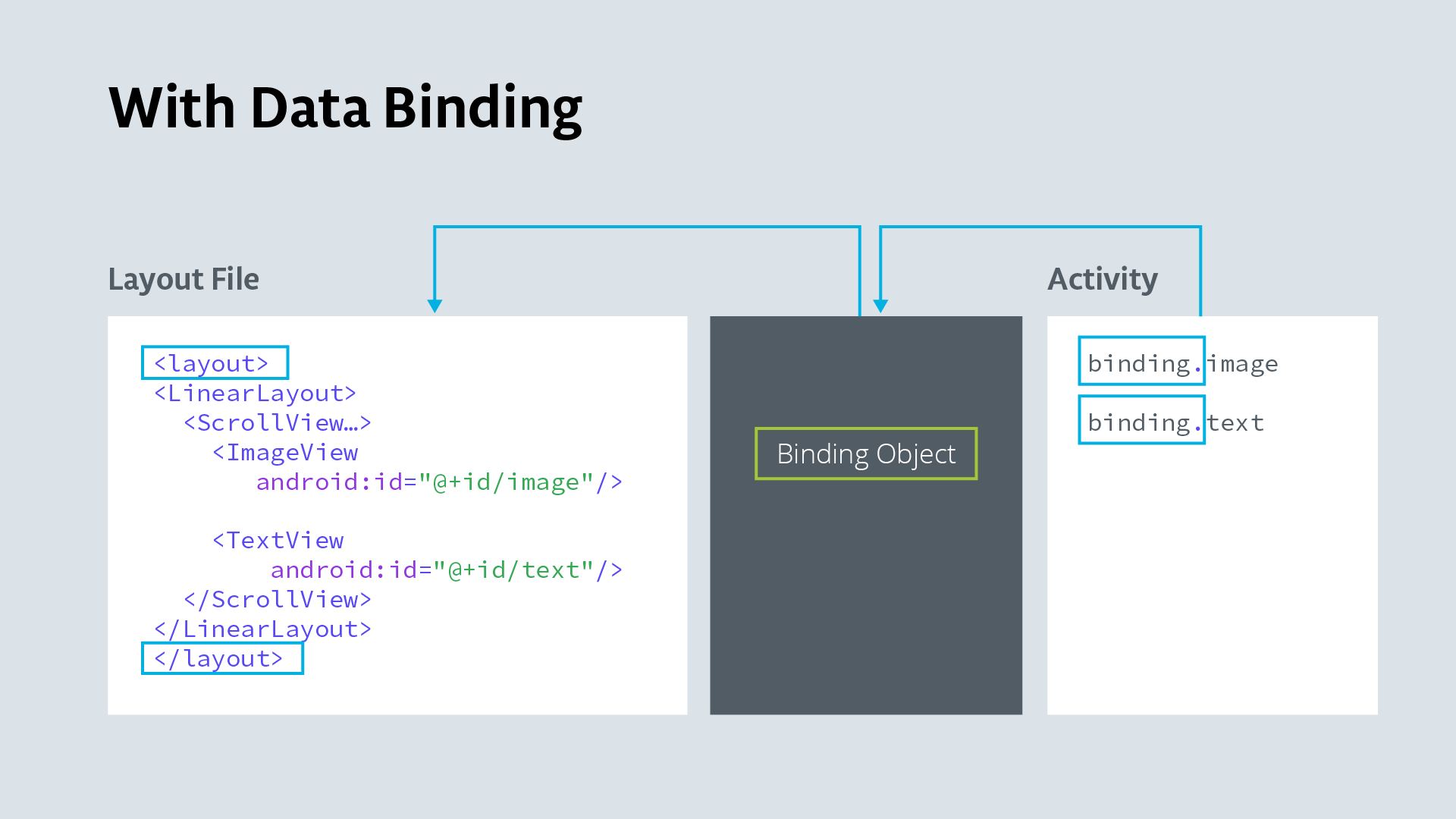
- The big idea about data binding is to create an object that connects/maps/binds two pieces of distant information together at compile time, so that you don't have to look for it at runtime.
- The object that surfaces these bindings to you is called the Binding object. It is created by the compiler, and while understanding how it works under the hood is interesting, it is not necessary to know for basic uses of data binding.
Data Binding and findViewById
- findViewById is a costly operation because it traverses the view hierarchy every time it is called.
- With data binding enabled, the compiler creates references to all views in a
<layout>that have an id, and gathers them in a Binding object. - In your code, you create an instance of the binding object, and then reference views through the binding object with no extra overhead.
Data Binding Views and Data
- Updating data and then updating the data displayed in views is cumbersome and a source of errors. Keeping the data in the view also violates separation of data and presentation.
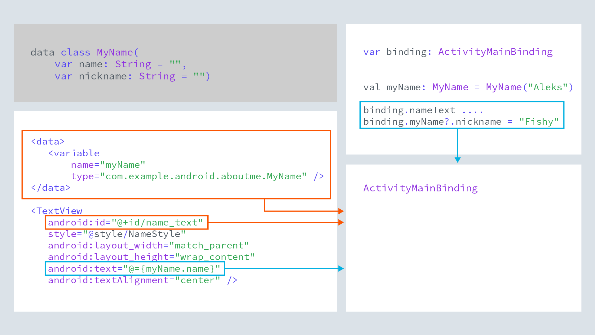
- Data binding solves both of these problems. You keep data in a data class. You add a
<data>block to the<layout>to identify the data as variables to use with the views. Views reference the variables. - The compiler generates a binding object that binds the views and data.
- In your code, you reference and update the data through the binding object, which updates the data, and thus what is displayed in the view.
- Binding views to data sets a foundation for more advanced techniques using data binding.
In this exercise you are going to improve the AboutMe app by using data binding instead of findViewById, and use actual data bound to the name_text and nickname_text views to display information.
Do the following:
Enable data binding in your build.gradle file in the app module inside the android section:
dataBinding {
enabled = true
}
Wrap all views in activity_main.xml into a
<layout>tag, and move the namespace declarations into the the<layout>tag.- In MainActivity, create a binding object:
private lateinit var binding: ActivityMainBinding - In onCreate, use DataBindingUtil to set the content view:
binding = DataBindingUtil.setContentView(this, R.layout.activity_main) - Use the binding object to replace all calls to findViewById, for example:
binding.doneButton.setOnClickListener….etc
Hint: You can use apply() in the click handler to make your code more concise and readable.
- Create a data class MyName for the name and nickname.
data class MyName(var name: String = "", var nickname: String = "") - Add a
<data>block to activity_main.xml. The data block goes inside the layout tag but before the view tags. Inside the data block, add a variable for the MyName class.<data> <!-- Declare a variable by specifying a name and a data type. --> <!-- Use fully qualified name for the type. --> <variable name="myName" type="com.example.android.aboutme.MyName" /> </data> - In name_text, nickname_edit, and nickname_text, replace the references to string text resources with references to the variables, for example>
android:text="@={myName.name}" - In MainActivity, create an instance of MyName.
// Instance of MyName data class. private val myName: MyName = MyName("Aleks Haecky") - And in onCreate(), set binding.myName to it.
binding.myName = myName - In addNickname, set the value of nickname in myName, call invalidateAll(), and the data should show in your views.
myName?.nickname = nicknameEdit.text.toString() // Invalidate all binding expressions and request a new rebind to refresh UI invalidateAll() - When you run your code, it should have no errors and look and work exactly the same!
If you want to start at this step, you can download this exercise code from: Step.05-Exercise-Implement-data-binding.
You will find plenty of //TODO comments to help you complete this exercise, and if you get stuck, go back and watch the video again.
Once you’re done, you can check your solution against the solution we’ve provided here Step.05-Solution-Implement-data-binding or using this git diff


Android Developer Documentation:
Android Developer Documentation:
In this exercise you are going to create the ColorMyViews project and add, align, and style the first box.
- Create an Android Studio project named ColorMyViews, check "Include Kotlin support", minSDK19; choose the "Empty Activity" template; check generate a layout file and compatibility. Run the app and it should display "Hello World!" in a TextView.
- Open activity_main.xml in Design view.
- Explore the layout editor and familiarize yourself with its different panels and controls.
- Change the default margin to 16.
- Play with the Hello World box. Move the view and change its dimensions. Explore attributes. What happens if you add or move constraints? Change the bias? Remember that you can undo any actions to return to your starting point.
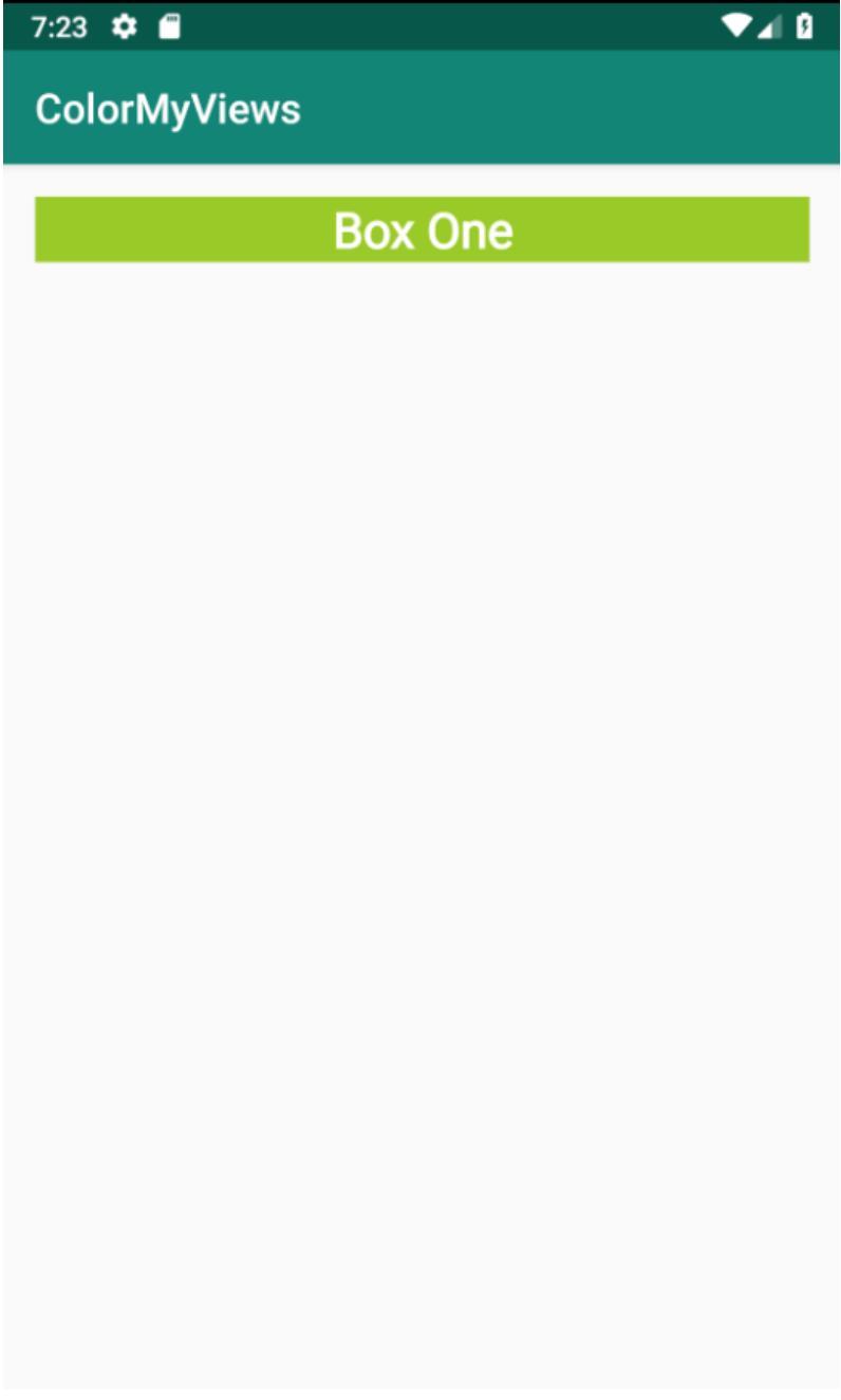
- Move the box into the upper-left corner with margins of 16dp. Give it an id of box_one_text and create a string resource box_one with a value of "Box One" for the text.
- Change the size and constraints of the box so that is glued to the top, and fills the width of the layout (match_constraint) and the height of the text (wrap_content).
- Add a style as shown in the code snippet below and style the box with it. You will have to add the roboto font to your project as for the AboutMe app. Style the box, extract the style, and extract the dimensions.
- Run your app and it should look like the image below.
Code snippet for the WhiteBox style:
<style name="WhiteBox">
   <item name="android:background">@android:color/holo_green_light</item>
   <item name="android:textAlignment">center</item>
   <item name="android:textSize">24sp@dimen/box_text_size</item>
   <item name="android:textStyle">bold</item>
   <item name="android:textColor">@android:color/white</item>
   <item name="android:fontFamily">@font/roboto</item>
</style>
If you want to start at this step, you can download this exercise code from: Step.01-Exercise-Add-Box-One.
You will find plenty of //TODO comments to help you complete this exercise, and if you get stuck, go back and watch the video again.
Once you’re done, you can check your solution against the solution we’ve provided here Step.01-Solution-Add-Box-One or using this git diff.


Android Developer Documentation:
QUIZ QUESTION
Match the constraint type with its correct description.


Android Developer Documentation:


Android Developer Documentation:
Important: When you build the app using the Layout Editor, your code may not be exactly the same as the solution, as ordering of steps matters when defining constraints. Also, for most layouts, there is more than one possible solution, and solutions different from the ones shown are not necessarily wrong, as long as they meet the requirements of the layout.
Android Developer Documentation:
Android Developer Documentation:
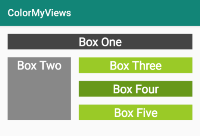
In this exercise you are going to add four more aligned boxes to your layout, modify the style, and then add a click handler to color the boxes when they are clicked. The image below shows how your layout should look.
- Add Box Two to your layout. Set the width and height to 130dp. Align it below Box One and to the left edge of the screen.
- Add boxes Three, Four, and Five below Box One and to the right of Box Two. Make them identically shaped, vertically aligned. The top of Box Three is aligned with the top of Box Two, and the bottom of Box Five is aligned with the bottom of Box Two. See the image below for reference and use a chain, additional constraints, and margins to achieve your objective.
- Add a click handler to MainActivity. Since this lesson is not about click handlers, the code is provided below for you to copy and paste.
- Update the WhiteBox style so that the boxes start out white with white font.
Click Handler Code
fun makeColored(view: View) {
   when (view.id) {

       // Boxes using Color class colors for background
       R.id.box_one_text -> view.setBackgroundColor(Color.DKGRAY)
       R.id.box_two_text -> view.setBackgroundColor(Color.GRAY)

       // Boxes using Android color resources for background
       R.id.box_three_text -> view.setBackgroundResource(android.R.color.holo_green_light)
       R.id.box_four_text -> view.setBackgroundResource(android.R.color.holo_green_dark)
       R.id.box_five_text -> view.setBackgroundResource(android.R.color.holo_green_light)

       else -> view.setBackgroundColor(Color.LTGRAY)
   }
}
If you get stuck, revisit the coding steps in the screencasts and use the solution code to compare your answers.
If you want to start at this step, you can download this exercise code from: Step.02-Exercise-Align-boxes-Click-handlers.
You will find plenty of //TODO comments to help you complete this exercise, and if you get stuck, go back and watch the video again.
Once you’re done, you can check your solution against the solution we’ve provided here Step.02-Solution-Align-boxes-Click-handlers or using this git diff.
Android Developer Documentation:
Android Developer Documentation:
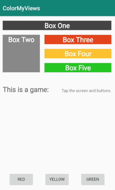
For the final functionality of ColorMyViews, you will do the following:
Below the set of boxes, add two TextViews; think of a label and some information. Use different font sizes for the label and text. The solution app only uses one line of text to avoid overlapping views on smaller devices, but you can experiment with a longer string.
Add a Baseline Constraint from the label to the info.
To situate these TextViews in the layout, add a fixed constraint of 16dp between the label and the info. This assures that they won't overlap, even if their width changes.
Constrain the top of info TextView to the bottom of BoxTwo, and use bias to vertically place it in the layout. Also, constrain both TextViews horizontally to the parent.
Add a horizontal chain of three buttons constrained to the bottom of the layout. Add any necessary constraints.
Test your layout by choosing different devices and orientations. The layout will not work for all of them, but should work for most.
Add the code shown below to the click handler. Don't forget to add the buttons to the list of views that are associated with the click handler.
Code to add to click handler:
// Boxes using custom colors for background
   R.id.red_button -> box_three_text.setBackgroundResource(R.color.my_red)
   R.id.yellow_button -> box_four_text.setBackgroundResource(R.color.my_yellow)
   R.id.green_button -> box_five_text.setBackgroundResource(R.color.my_green)
Code for the complete list of views:
val clickableViews: List<View> =
       listOf(box_one_text, box_two_text, box_three_text,
               box_four_text, box_five_text, constraint_layout,
               red_button, green_button, yellow_button)
Here is a screenshot of the finished app.
If you want to start at this step, you can download this exercise code from: Step.03-Exercise-Basline-constraint-Button-chain.
You will find plenty of //TODO comments to help you complete this exercise, and if you get stuck, go back and watch the video again.
Once you’re done, you can check your solution against the solution we’ve provided here Step.03-Solution-Basline-constraint-Button-chain or using this git diff.
We talked about ART.
It turns out that going from demo to art can take a chunk of work … and is a lot of fun. Think about this simple game. Start from the final code in the repo. How can you make this a complete game?
Here are some ideas:
- Use images instead of colors, and reveal the images. You can even create a picture memory game!
- Use one image and break it up into sections to reveal over time.
- Get rid of the text and buttons and just fill the screen with boxes. Implement one of Piet Mondrian's Paintings!
- Take the AboutMe app and remake it using ConstraintLayout with a more creative arrangement of information.
- Style the app to uniquely represent you and your personality.


 )
0 Comments